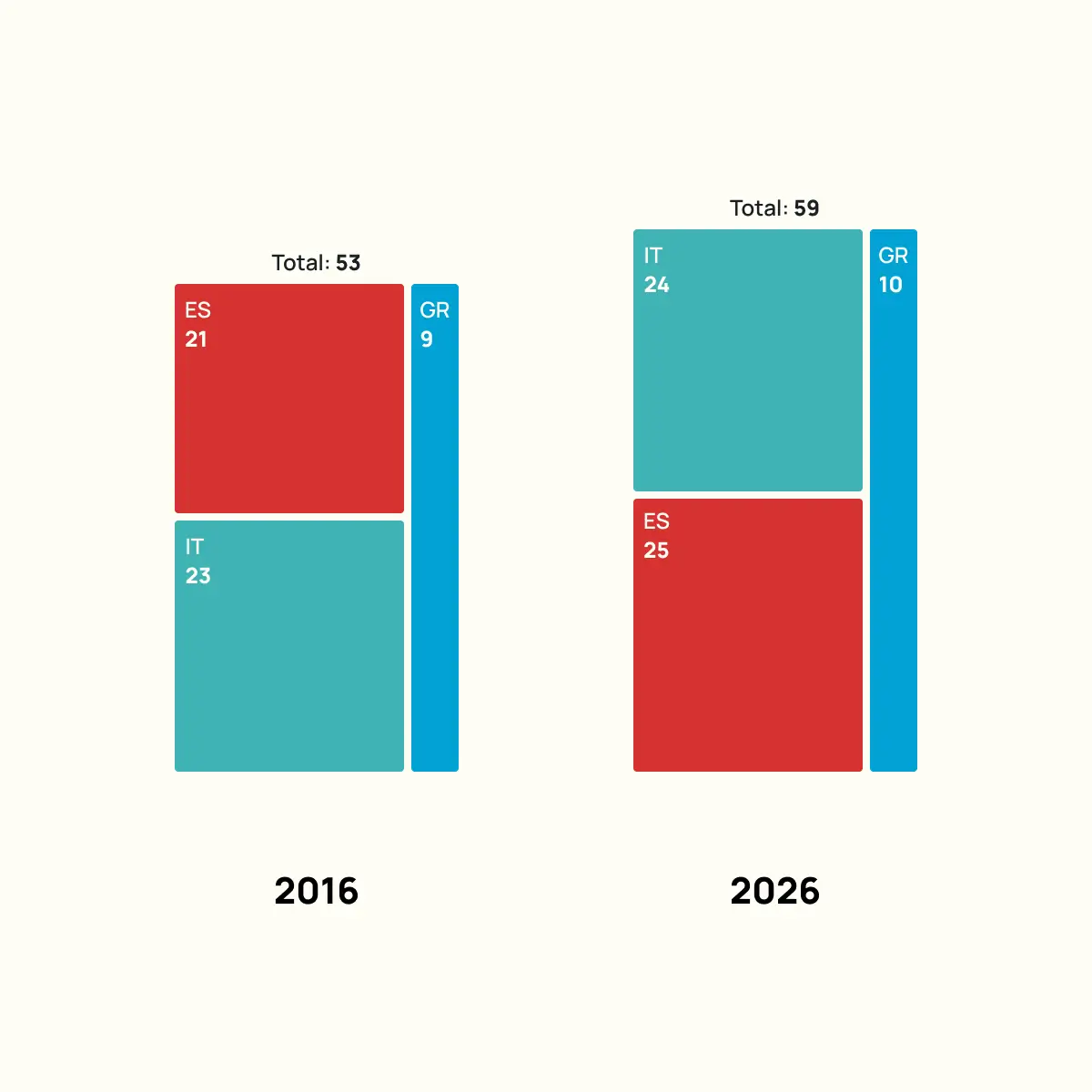
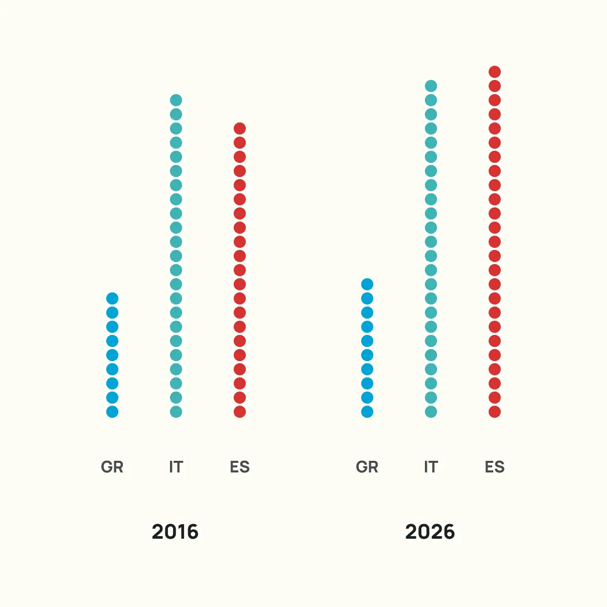
Case study: Tourism intelligence

Different ways to display tourism data

One dataset with six data points. A new visualisation published every day.

This series of LinkedIn posts from one of the VIZDATA co-founders takes a single, simple tourism dataset and tries to answer the question: how many distinct visual stories can the same numbers tell?

The dataset we use is fictional, though very close to reality. It is deliberately simple, but contains enough information to support comparison, change over time, proportion, and ranking.

Read more
1

#1

A slope chart connects two points in time with a line, making the direction and steepness of change the primary reading.

Lines that cross signify overtaking, making shifts in ranking visible at a glance, while parallel lines signal stability.

It is a format built for simplicity: two time periods, a small number of categories, and a clear comparison of growth, stagnation, or shifts in position.

Adding a third time period transforms it into a line chart, risking the focused comparison that makes the slope chart worth considering.

2

#2

Instead of using gridlines, a treemap encodes values as rectangular areas, making the relative size of each category the first thing the eye registers.

Placing two treemaps side by side turns this into a composition comparison, showing how proportional share shifted between two time periods.

Proportion is usually easy to spot, but when two rectangles are close in size, the difference is hard to judge without the labels.

The layout itself can also carry meaning: changing the position of categories between the two panels can reinforce the story of a ranking shift.

3

#3

An arc chart places two time periods on perpendicular axes and connects each country’s values with a curved line. The further an arc stretches along one axis relative to the other, the more that value changed.

This format is better suited to datasets where the differences between time periods are more pronounced, as similar values produce arcs that are hard to tell apart.

It is an unconventional choice for this data, but understanding how it works prepares you to use it when the right dataset comes along.

4

#4

A bar chart on a map places each bar at the geographic location of the country it represents, encoding values and spatial context in a single frame.

The format suits datasets with a small number of distinct locations, where the spatial relationship between categories is part of the story. Here, it places Spain, Italy, and Greece in the context of Mediterranean tourism markets rather than reducing them to labels on an axis.

The trade-off is that bars at different positions on a map are harder to compare than bars on a shared axis. Value labels close that gap, turning what could be a weakness into a manageable compromise.

5

#5

Splitting a donut chart in half and placing the two periods side by side turns a composition chart into a comparison chart. Each half shows how the total breaks down, and the mirrored layout makes shifts in share visible without any additional explanation.

The donut chart is one of the most criticised formats in data visualisation, and some of that criticism is well earned. With too many categories, the arcs become impossible to compare. With just three categories, the format holds up.

Judging the difference between two arcs of similar size still relies on the labels more than on the visual encoding, but the overall story of who gained and who lost share comes through clearly.

6

#6

A radial dot cluster chart represents each unit in the dataset as an individual dot, arranged in a circular pattern. The size of each cluster corresponds directly to the value it represents: more airports, more dots. This encoding works with the way a certain percentage of people naturally process quantity.

Instead of interpreting a bar’s length or an arc’s angle, the reader sees a collection of discrete objects. The count becomes something spatial rather than abstract. The circular arrangement keeps the layout compact and visually balanced across categories of different sizes.

Placing 2016 and 2026 side by side makes growth visible as the physical expansion of each cluster.

7

#7

Adding a third dimension to a stacked bar chart increases its visual presence on a slide or in a report, giving the data more physical weight. The extra dimension adds no new information to the data, and it makes precise comparison between segments harder.

We register the full height of each block before breaking down what is inside it. The stacking prioritises totals over individual segments.

Choose this format when memorability matters more than precision, and where exact values are secondary to the overall story.

8

#8

When your dataset contains small, countable values, replacing a bar with individual marks lets the audience register the quantity without referencing an axis. Each line is one airport, and the count is built into the visual itself.

Mirroring two time periods around a shared centre axis turns each row into a direct comparison, where growth is visible as the longer side. The bilateral layout makes asymmetry obvious.

The format is built for exactly two points in time. A third period would break the mirrored structure and require a different approach entirely. Clarity also depends on keeping the numbers small so that each mark is countable at a glance.

9

#9

Each square is one airport. Stacking them by country into a single column per year lets the reader do two things at once: see the total and count how much each country contributes.

The encoding replaces continuous bar length with discrete units, so the data reads as a collection of items rather than an abstraction.

The format suits small, countable numbers. As the values grow, counting squares stops being practical and a standard stacked bar does the job more efficiently.

The usual stacked limitation applies too: segments in the middle share no common baseline, so comparing them across years takes more effort.

10

#10

The human brain compares diameters, not areas, so when values are encoded as circles, readers consistently underestimate the differences between them.

A value that is three times larger can look only twice as large, because the eye measures across the circle rather than calculating its surface. This is not a minor distortion. It reshapes how the reader interprets the data.

If the labels are doing the real work of communicating the numbers, it is worth asking what the bubbles are contributing that a simpler format would not. Without labels, the chart misleads. With them, the circles risk becoming decoration rather than encoding.

Choose this format when the goal is to convey a general sense of hierarchy and proportion, not to invite precise comparison between values. When the reader needs to see which category dominates and which is marginal, scaled circles communicate that quickly.

11

#11

This format prioritises the difference between two time periods over the absolute values, which means it is less effective when the reader needs to compare totals across countries.

Two dots and a connecting line per category turn the gap into a visible length, so the reader sees which country grew the most without reading a single number.

It is a close relative of the slope chart, and the two are often confused. But a slope chart uses the angle of the line to encode direction and rate of change, while the dumbbell plot uses the length of the line to encode the size of the gap. The slope chart answers “who overtook whom”, and the dumbbell plot answers “by how much.”

Choose this format when the magnitude of change is the main story.

12

#12

The point of this format is not to count individual hexagons. You look at the three clusters and immediately see which country has the most airports and which has the fewest.

Hexagons fit together with minimal gaps, so each cluster holds together as a single shape. That makes the size difference between groups the primary reading, not the individual units inside them.

The lighter hexagons at the edge of each cluster separate the 2026 additions from the 2016 baseline, so the reader sees both the total and the change in one view.

Choose this format when approximate proportion is the message and precision is secondary.

13

#13

Replacing solid bars with stacked dots gives the reader two ways into the data: the overall height works like a bar chart for quick comparison, while each dot remains individually countable for precision.

This format is self-labelling. The count is built into the visual itself, which is why we can drop axes and gridlines entirely, but that simplicity comes with a condition.

The values need to stay small enough to count at a glance. Once a column reaches ten dots, the reader stops counting and starts estimating, and at that point, a standard bar chart with a labelled axis would do the job more efficiently.

Choose this format when you want your data to feel tangible and your layout to stay minimal, but test it against your actual numbers first.

14

#14

A connected bar chart layers multiple readings into a single frame. Each bar carries the absolute value, the annotations between rows show the percentage change, and the totals on the right give the overall picture. The reader does not need to switch between charts or do any arithmetic.

The connecting lines are what hold the format together. Without them, this would be two separate bar charts.

The lines turn the layout into a sequence, guiding the eye from one time period to the next and making the change feel continuous rather than disconnected.

15

#15

Swapping abstract squares or dots for an icon that matches the subject makes the chart self-explanatory. The reader recognises what they are counting before reading the label.

The grid layout keeps the count orderly, while colour separates the two time periods inside each country’s column.

Choose this format when the subject of your data is something the reader can picture as a real object, and when the values stay small enough to count at a glance. Do not push past that because the icons stop being countable, which removes the reason for choosing pictograms in the first place.

16

#16

When the visual impression of proportion matters more than precise comparison, a radial stacked bar chart does the job in a single compact shape.

Each ring represents a time period and each segment a category’s share, so composition and change over time sit in one frame.

It is a format built for presentations and reports where the chart needs to carry visual weight, not for analysis. It also gives a familiar dataset a shape that stands out in a deck of standard bar charts.

17

#17

Choose this format when you want the audience to read change as a single visual impression rather than a set of figures, and when your dataset has enough spread between values for the shapes to stay distinct.

It suits moments where the feeling of movement matters more than the exact numbers, like an opening slide that sets up a story the rest of the deck will quantify.

Overlapping areas and shared edges make individual values harder to extract, which is why this format rewards wider spreads and fewer categories than a dataset of this size.

About the project

Each visualisation in the series uses the same data but changes the chart type, the story angle, and the interpretation. The style and colours stay consistent, but what each visualisation chooses to emphasise is different every time.

Different questions demand different visual approaches, and the default chart in your data visualisation tool of choice is rarely the best one.

Dashboards, infographics, and stakeholder reports across every industry rely on the same two or three chart types regardless of what the data is actually saying. We think there is a better way to work.

An organisation presenting data to its members or stakeholders will communicate more effectively with a visualisation chosen for the story it needs to tell, not the one that happened to be the software default.

Work with us

If your organisation needs to present data to members, stakeholders, or funders, we can help you choose the right approach and build it.

VIZDATA designs and develops custom data visualisation tools, interactive dashboards, and reporting platforms for organisations that take their data seriously.

Discuss a project